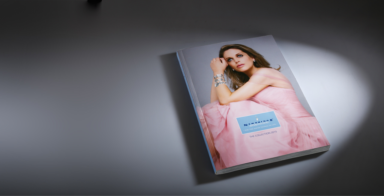

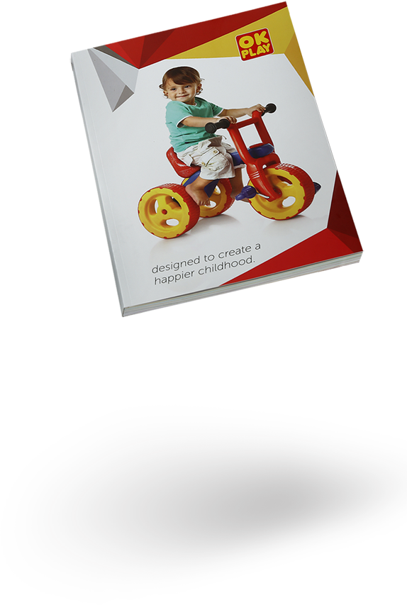
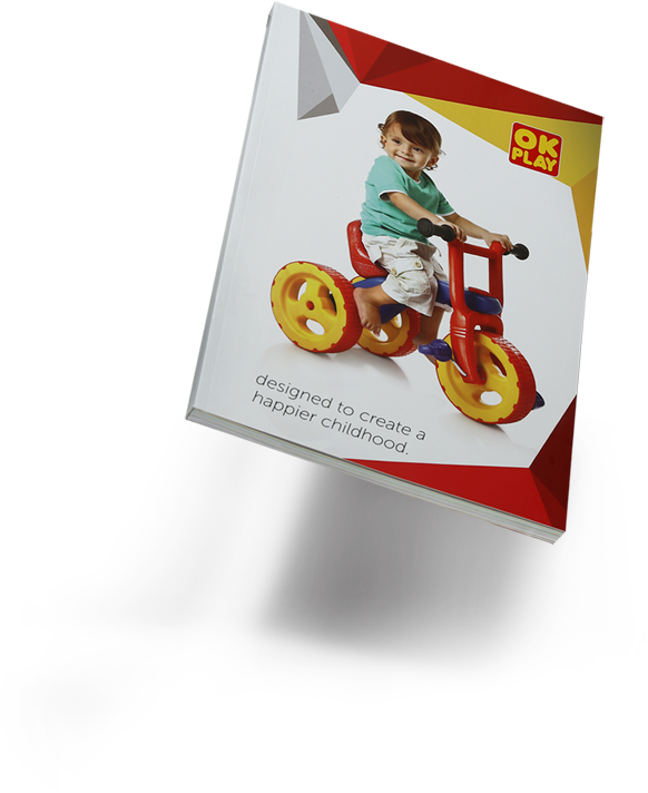
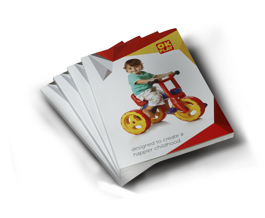
A good visual communication
in the form of a nicely
designed product catalog,
enables an effective brand
perception and also
results in establishing
a stronger sales with
customer loyalty.
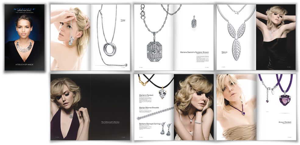
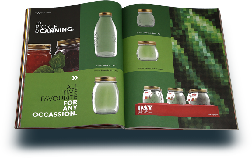
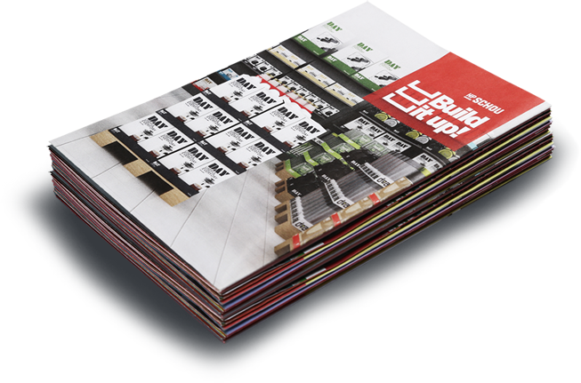
Precision photography was a highlight in this meticulously drafted product catalog which included more than 700 product images and around 40 model and ambience photos, each given a dedicated attention and value so that not even a single product is lost in view while the catalog is being use.

bugatti

ego
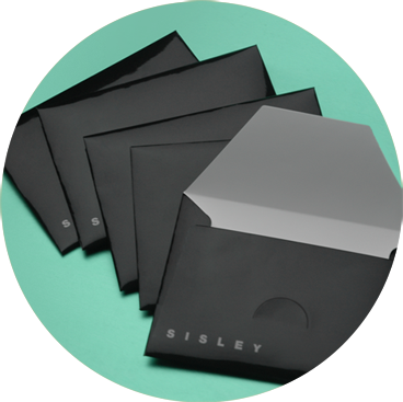
sisley
product display catalog
for a multi product brand

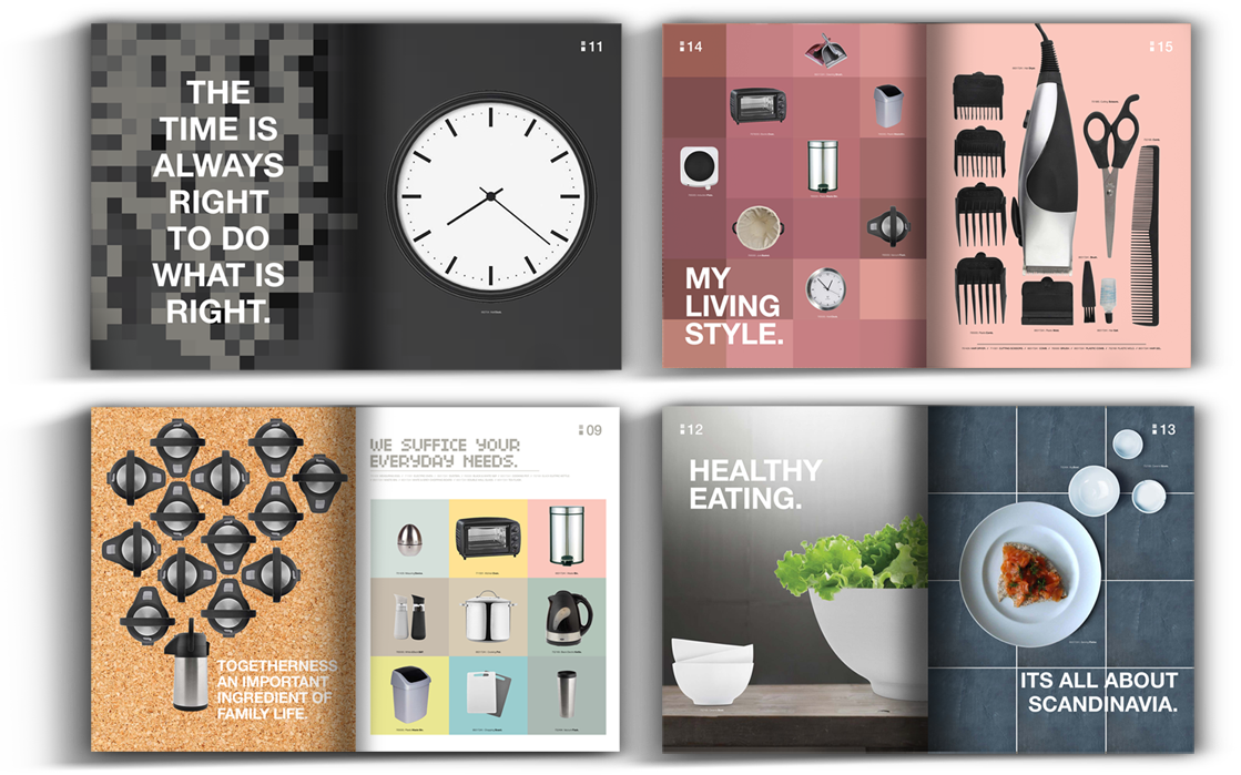
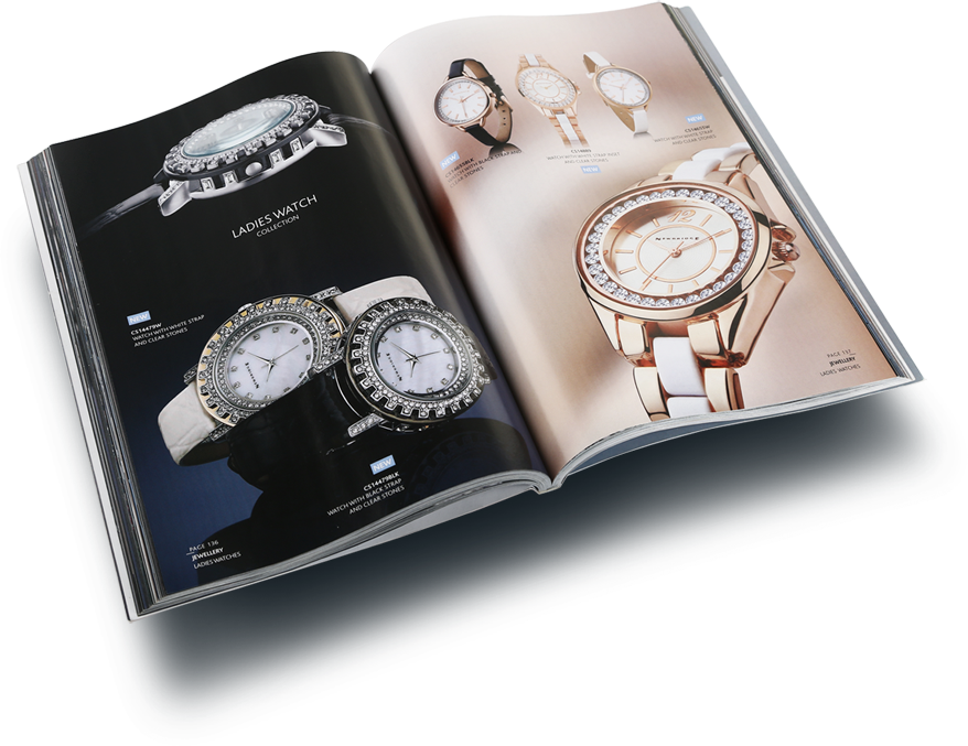
Watches
Lighting
Tabletop accessories
Kitchen accessories
Toys
Pizza delivery box
Electric public vehicle
Jewelery
Cutlery
Oven
Mannequins
Fan
Chair
Furniture
Home Appliances
Christmas Decor
Hotel
Tour & Travel
Food and Bakery
Storage
Textiles
Clothing
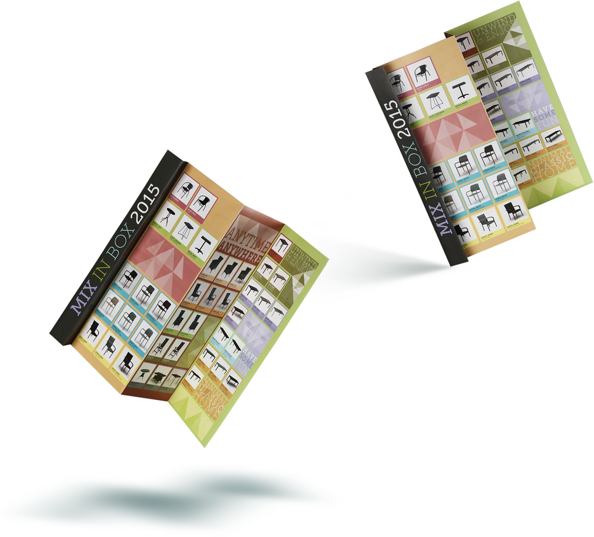
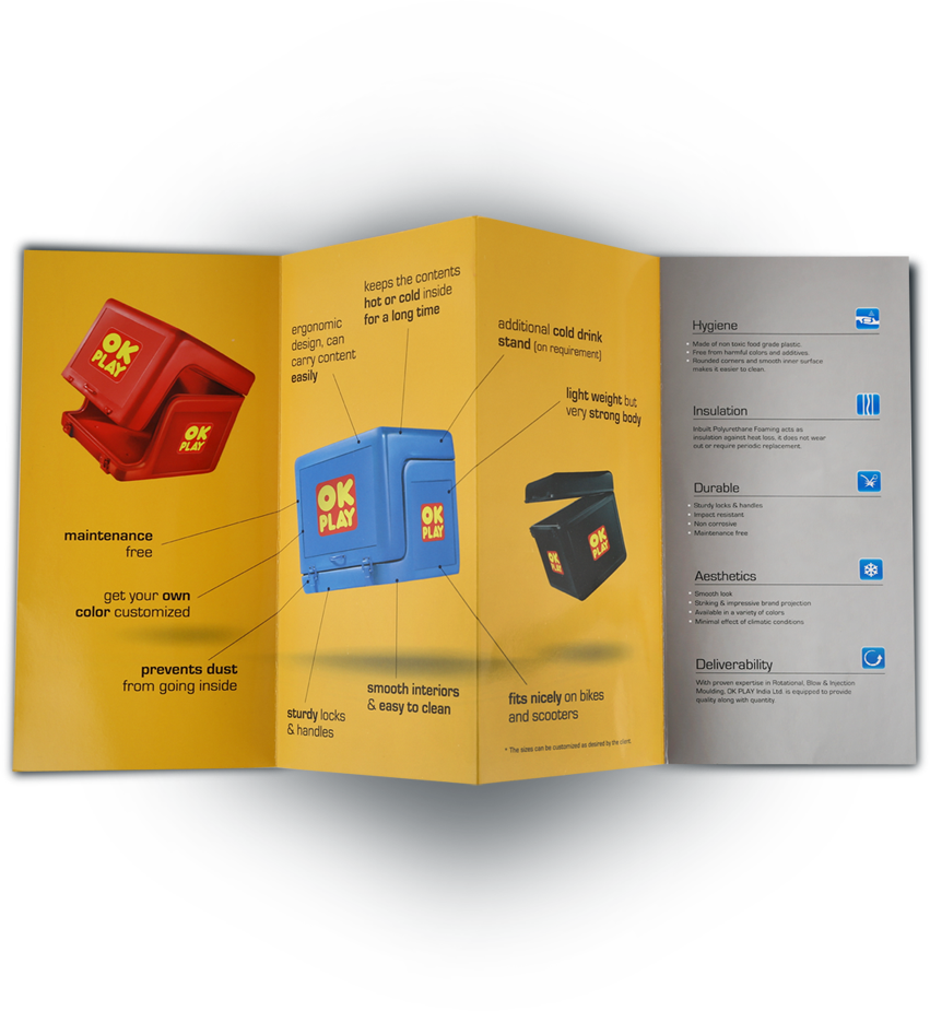
 A 13 fold fanfold leaflet for a luxury lifestyle product
range.
A 13 fold fanfold leaflet for a luxury lifestyle product
range.
